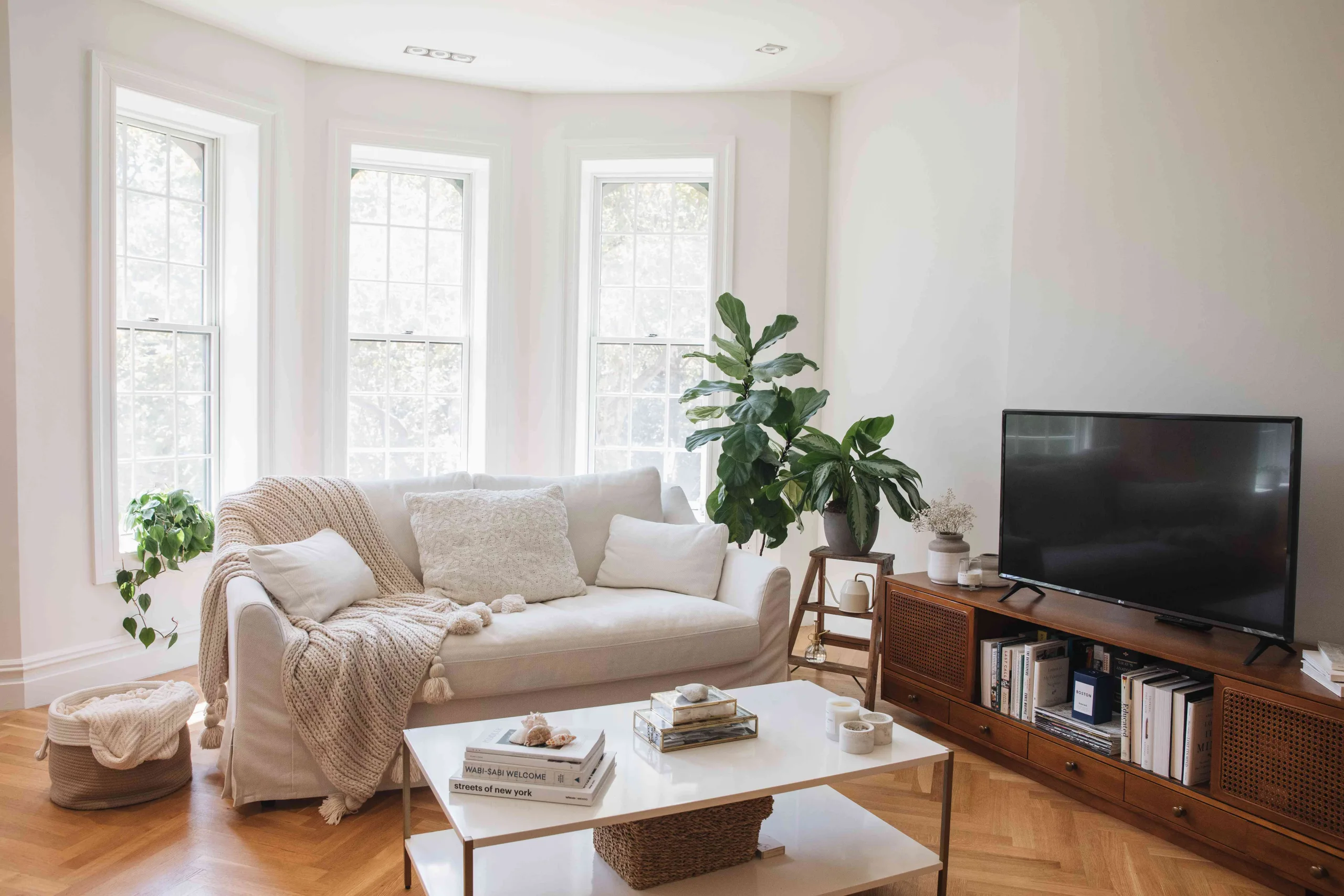
You’ve probably noticed that some rooms feel assembled, not designed. At first sight, everything looks nice: all the furniture sort of matches, yet something still feels slightly off and the room never becomes the one you pictured when you bought the pieces.
Here is the good news: the gap is rarely about budget. It comes down to following a handful of rules. Commercial designers apply the same set of layout rules on every project, whether it’s a 200-person corporate office or a boutique hotel lobby. And the same rules work just as well in a living room, a bedroom, or a home office, because people move through space the same way everywhere.
Below are five rules. Each one comes with a home application and a commercial equivalent, so you can see how the logic carries across.
Rule 1: Space Plan Before You Select
Draw the room to scale before you buy anything. Then, choose furniture to fit a confirmed layout and never bend the layout to fit pieces that have already arrived.
At home, this can be as simple as graph paper or a free floor-plan app. Measure the walls, mark the doors and windows, then sketch the sofa at its real dimensions. Can you walk behind it? Does the door still open fully? It is much easier to find out on paper than after the delivery team has left.
Offices follow the same habit, with more at stake. Before a single chair goes through furniture specification, designers place every workstation, walkway and exit on a floor plan. A mistake caught at that stage costs a few minutes. Once the furniture is on site, it costs far more. The scale is different, but the thinking is the same.
Rule 2: Circulation Clearances Are Not Suggestions
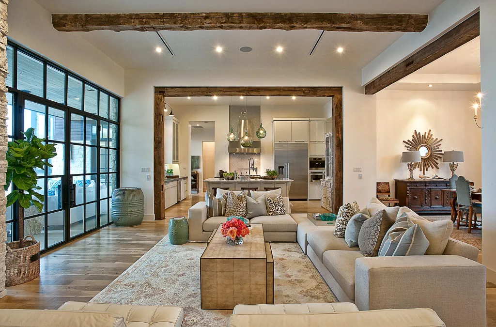
Measure every clearance before you settle on the size of any large piece. These numbers exist because they match how people actually move, so treat them as minimums.
| Space | Minimum clearance |
| Main walkway | 36 inches |
| Sofa to coffee table | 18 to 24 inches |
| Behind dining chairs (to wall or next piece) | 42 to 48 inches |
At home, the most common slip is a coffee table placed 12 inches from the sofa. It looks fine in a photo, but your knees and your guests notice right away. Most living rooms have a version of this problem, and the fix is usually a slightly smaller table rather than a bigger room.
Offices follow the same numbers, and many are backed by accessibility standards and building codes. In the US, the ADA sets a 36-inch minimum for accessible routes, and fire codes set egress widths. Designers did not invent these rules for the sake of regulation. They reflect how bodies move, which is why they work in a living room too.
Quick check before you buy:
- Mark each clearance on the floor with painter’s tape
- Walk the main path with your arms full, as if carrying groceries
- Pull out a dining chair and see if someone can still pass behind it
- Open every door and drawer near large furniture to full range
Rule 3: Scale Before Aesthetics
Look up the scale reference for each major piece before you buy it. A beautiful piece at the wrong scale can spoil a room, while an average piece at the right scale holds everything together.
At home, scale is where most rooms go wrong. Pieces are chosen for how they look in a showroom, where ceilings are high and floors are wide open. Once they arrive, they read very differently. The good news is that scale has specific, repeatable numbers, and they are almost always right.
| Element | Reference measurement |
| Pendant above a dining table | 30 to 36 inches above the tabletop |
| Artwork above a sofa | Bottom edge 6 to 8 inches above the sofa back |
| Coffee table height | 1 to 2 inches below the sofa seat |
| Sofa distance from wall | 3 to 6 inches |
Offices rely on the same idea, only more formally. Every piece of commercial furniture is checked against a scale specification before it is ordered, so the spec sheet is really a scale document. Heights, widths, and depths are confirmed against the room and the pieces around them, long before anything is delivered. That is why a well-planned office rarely has the “too big for the room” feeling that so many homes do.
Before you buy, check:
- The piece’s height, width, and depth against your floor plan
- How it sits next to the largest piece already in the room
- The ceiling height, especially for tall bookcases and pendants
Rule 4: Furniture Faces a Focal Point
Name the focal point before you place a single piece. Everything else in the room responds to it.
Every seating group needs one anchor: a fireplace, a view, a TV wall, or a piece of art. At home, a room without a clear focal point tends to produce furniture that points in different directions. The sofa faces the window, the chairs face the TV, and the whole space reads as confused, even when each piece is lovely on its own.
Offices solve this by deciding the focal point first. In a conference room, it is the screen wall, and every chair faces it. In a reception lobby, it is the brand feature wall, and the seating is arranged to respond to it. This kind of decision sits at the heart of commercial interior design, where the layout is built around one anchor first and everything else follows.
Common focal points and how to arrange around them:
| Room | Typical focal point | Arrangement |
| Living room | Fireplace, view, or TV wall | Seating angled toward it, with a clear sightline from every seat |
| Bedroom | Bed and headboard wall | Bed centered on the wall, nightstands on both sides |
| Home office | Desk and window or wall | Desk placed so the main seat has a calm view |
| Conference room | Screen wall | Every chair faces the screen |
| Reception | Brand feature wall | Seating arranged to respond to it |
If your room has two focal points (a fireplace and a view, for example), choose the stronger one for the main seating group and let the second one work as a secondary zone.
Rule 5: Three Layers of Light, Not One
Add at least one floor or table lamp to any room that relies on a single overhead source. This one change often does more for a room’s atmosphere than any new piece of furniture.
Good lighting works in three layers, and each has a different job.
| Layer | What it does | Typical examples |
| Ambient | Fills the room with general light | Ceiling fixtures, recessed lights, large floor lamps |
| Task | Supports a specific activity | Desk lamp, reading light, under-cabinet lighting |
| Accent | Draws the eye to a feature | Picture lights, wall washers, small spotlights |
At home, a single overhead fixture is the most common lighting mistake. It gives you one mode, usually a harsh one, with no way to adjust for the time of day or what you are doing. Reading, watching a film, and having friends over all need different light. When you add a lamp at seat height, the room softens, shadows get gentler, and the space starts to feel lived in rather than lit.
Offices separate the three layers from the start. An open-plan floor typically uses overhead ambient light, a task light at each workstation, and accent lighting on architectural details or branded wall elements. The layers are planned together, so people can work comfortably without the whole room feeling flat or glaring.
Quick lighting check for your room:
- Count your light sources. If the answer is one, add a lamp
- Put at least one light at seat or eye level, not only on the ceiling
- Give every task area (desk, reading chair, kitchen counter) its own light
- Use warm bulbs, around 2700K, in living spaces for a softer feel
- Add a dimmer to the main fixture if you can
Closing Thoughts
These rules work in a living room, a bedroom, a home office, and a 10,000 sq ft commercial fit-out, because the logic underneath them is the same.
If you want to start small, pick the room you use most and do one thing this weekend: tape out the clearances from Rule 2 and walk through them. It takes about fifteen minutes. Most people find at least one piece that needs to move, and that single change is often where a room first starts to feel designed.
You do not need to apply all eight rules at once. Follow one, see the difference, then move on to the next.